
Brand centre
The Pulse identity,
in one place.
Three marks, the full set behind them, both backgrounds, the palette and the type. Take what the work in front of you needs, or take the whole set.





The complete set
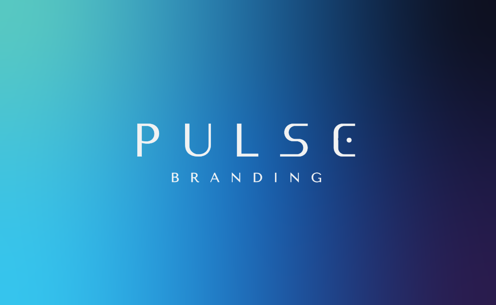
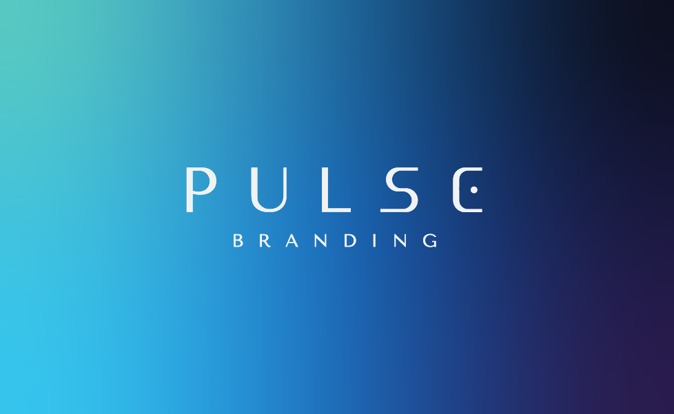
The other seventeen artboards, for the work that needs a tagline, a service line, one ink, or the gradient plate.
On navy






On paper


One colour





























On the wash












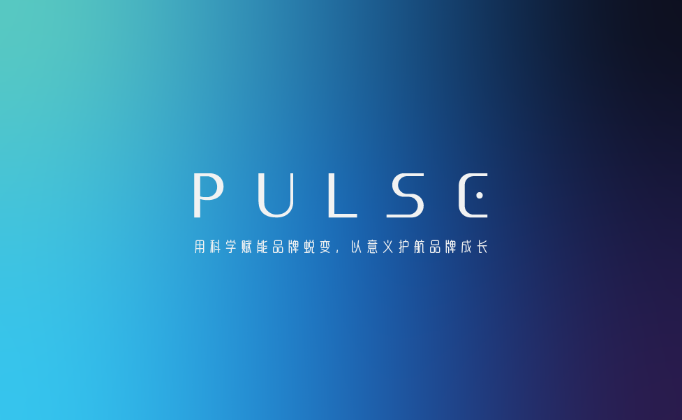

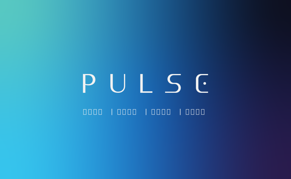


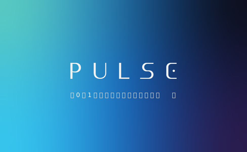


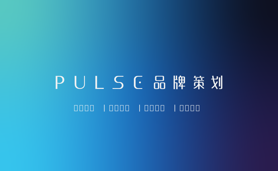

Four rules, so it stays the same logo
These are the ones people break. Everything else follows from them.
Clear space
One P-height on every side. Nothing enters that space: no rule, no image edge, no second logo. The descriptor sits inside the lockup, so it is never re-set beside it.
Smallest size
19px tall in a header, 15px in a footer. Below that the descriptor stops reading, and a lockup nobody can read is worse than the mark alone.
Never re-letter
The wordmark is drawn, not typed. Do not set PULSE in a font, do not add a full stop, do not open the C, do not move the dot out of the counter.
Never a substitute
White goes on navy, navy goes on paper. No black recoloured to pass as navy, and no older PNG standing in for the 2025 lockup.
The background
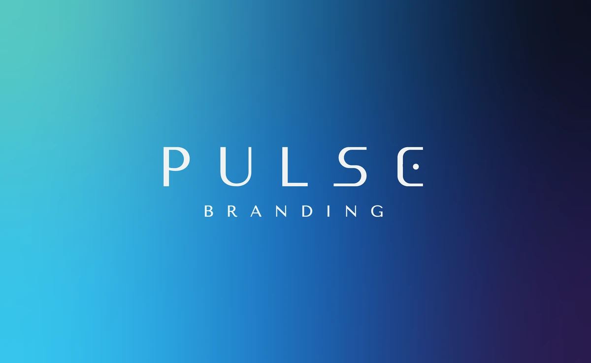
Two grounds, both built in the browser. The site composes its own from nine blurred circles in two groups, a veiled base ramp and a grain plate; the rebuild runs the aurora canvas. Neither is a single gradient. The plate below is the site's ground rebuilt in CSS, not a picture of it.
Behind the white mark
Both plates are grounds for the mark. The white lockup sits in the dark half, never across the cyan corner.
Never under body copy
Text sits on navy or on paper. A wash behind a paragraph is a contrast problem dressed as a mood.
Pick one, per scene
The wash for section grounds and full-bleed blocks; the aurora for a hero. Never both in the same view.
Colour
Navy holds the work, ice carries the words on it, and the two accents do the pointing.
Type
Three faces, each with one job. All three are self-hosted, so nothing depends on a network font and the pages never shift while they load.
Evolving brands with science.
We build brands that hold up under contact with a real market.
one line of feeling
Voice
How the studio writes, on any surface, in either language.
Direct
Say the thing first. If a sentence needs a second sentence to survive, delete the first one.
Concrete
Numbers, names, dates and places. An adjective is a place where a fact was meant to be.
Quiet
The work is the argument. Confidence is a short sentence, not a loud one.
Never the consultant vocabulary. If a sentence still works with the adjective taken out, the adjective was doing nothing.
Everything, in one file: all twenty-three 2025 artboards as SVG and PNG, the six marks on this page, and the three typefaces.