
Brand identity
Make the idea
impossible to mistake.
We turn strategy into a visual and verbal system people can recognise, remember and trust, across a package, a screen, a sentence or a moving interface.

The test
Remove the logo.
Is the brand still there?
Recognition comes from a system of signals: type, colour, image behaviour, language, proportion, motion and repetition. A logo can participate in that system. It cannot substitute for one.
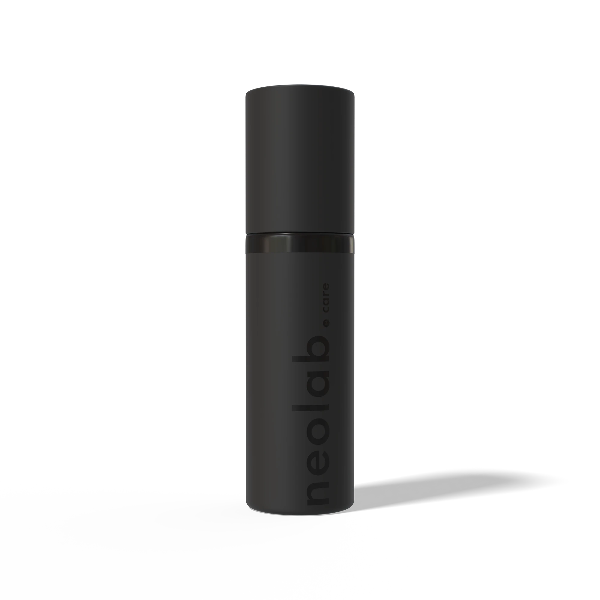
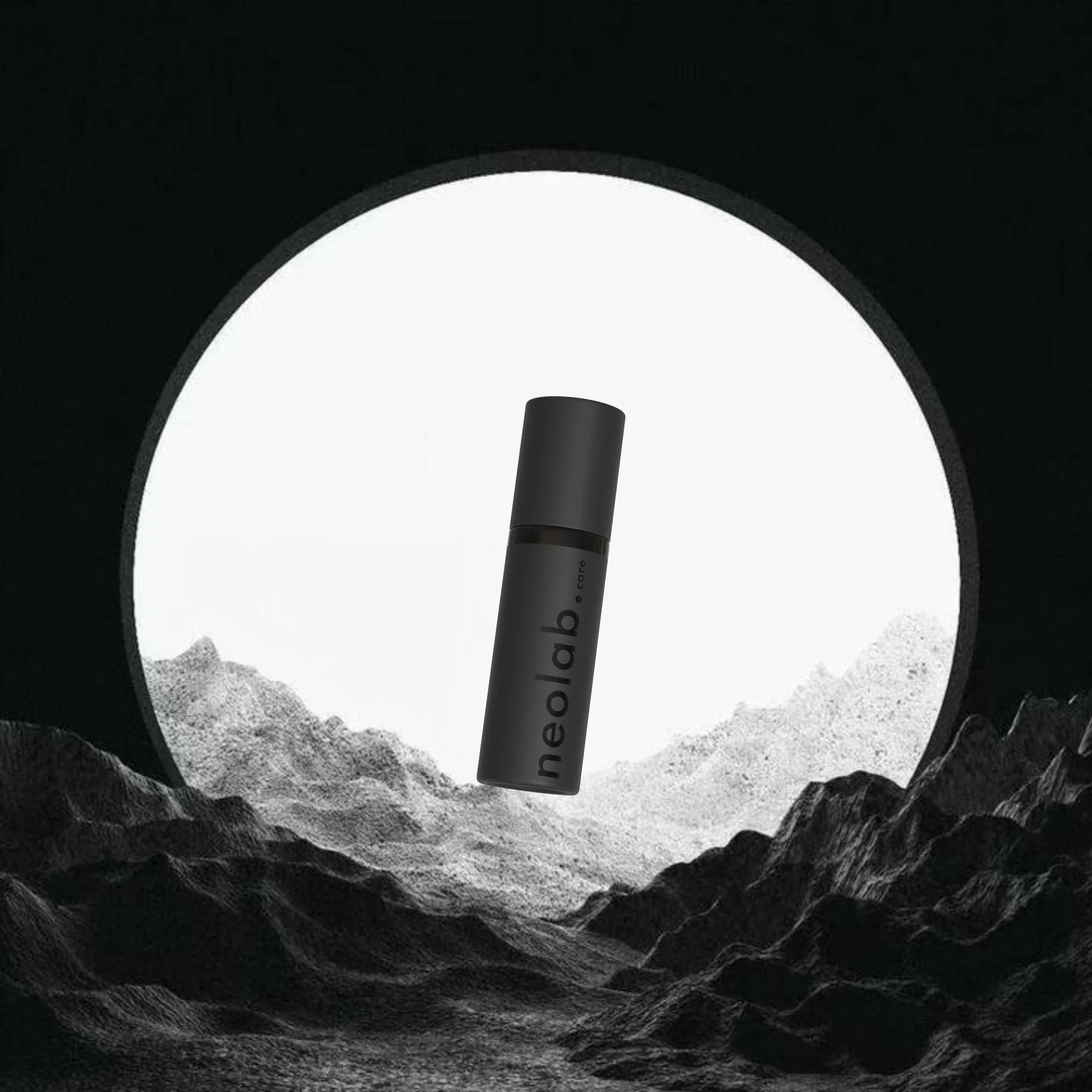
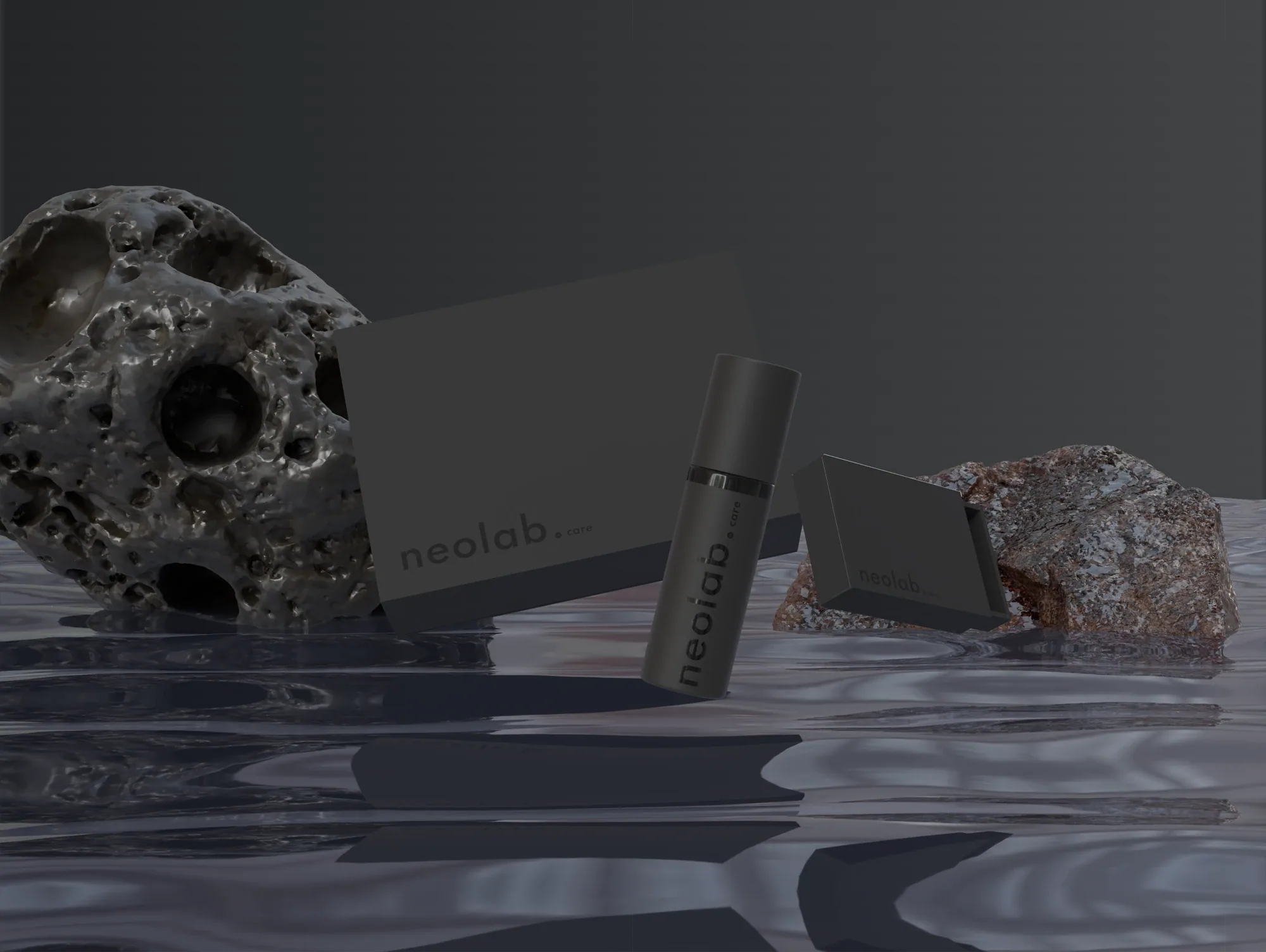
NeoLabCare
Clinical restraint and a monolithic product focus.
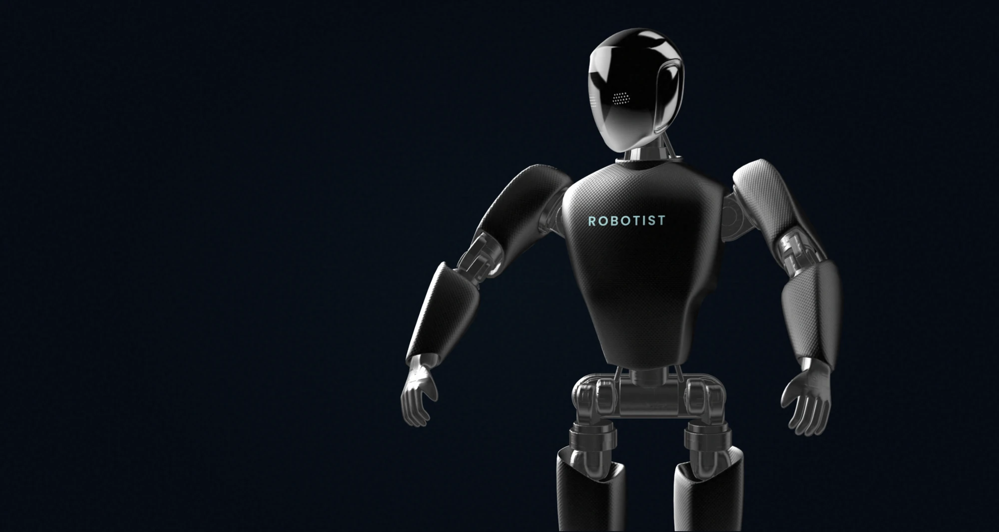
Robotist
A character that behaves like a host rather than a machine.

GramLingo
A teaching world built around the mascot before the interface.
01 · NeoLabCare
One object had to carry an entire routine.
The system became quiet, precise and reduced enough to make compression feel intentional rather than compromised.
02 · Robotist
Robotics needed a host.
The character and wordmark make a technical category feel easier to enter, without making the technology childish.

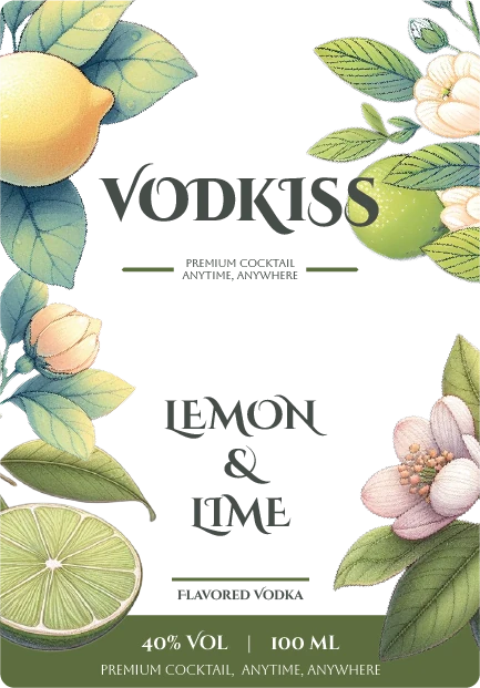
03 · Vodkiss
The occasion was part of the product.
Pack structure, label and gifting behaviour were designed together rather than decorated separately.
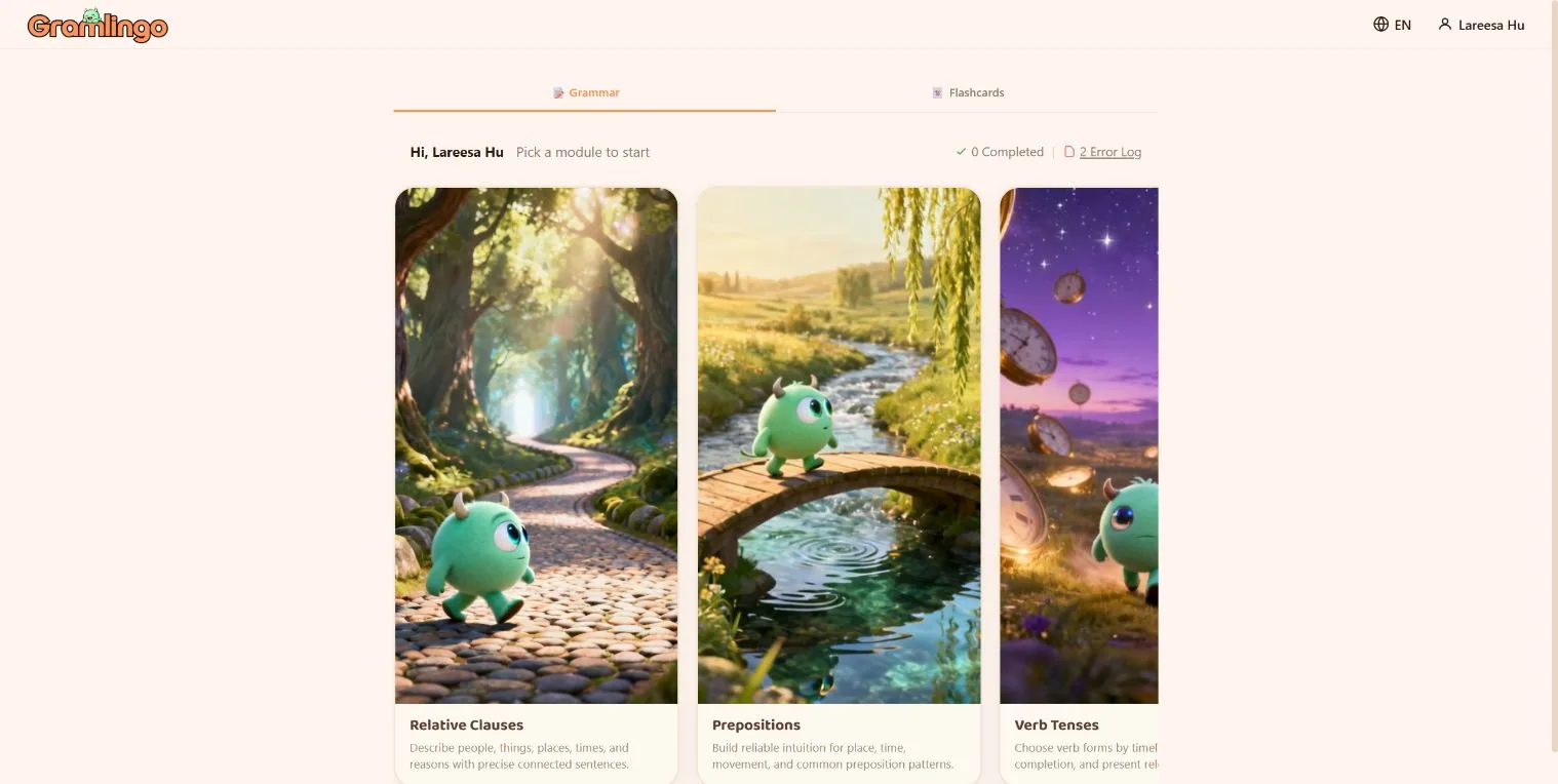
04 · GramLingo
The teacher was also the identity.
Character rules came first, because the mascot had to survive lessons, navigation, animation and the scale of an app icon.
How a system is built
One idea.
Seven expressions.
- Position
- Recognition device
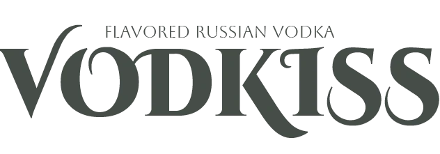
- Type
- Colour
- Imagery
- Language
- Motion
The sequence matters. Colour cannot rescue an unclear position. Motion cannot create recognition that does not exist when the screen is still.
A brand is not static once it enters a screen.
Interfaces reveal whether an identity is really a system. Type has to respond. Colour has to carry state. Motion has to communicate hierarchy. The brand has to survive interaction.
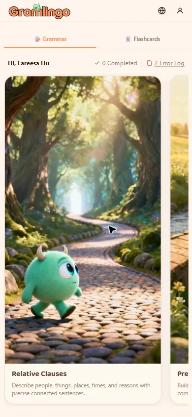
Progress is carried by the character, not by a progress bar.
One decision per screen. Everything else recedes.
The same rules hold from a 60px icon to a full interface.
What we build
Enough structure to stay coherent. Enough freedom to stay alive.
- Visual identity
- Mark, typography, colour, imagery and recognition rules.
- Verbal identity
- Proposition, message hierarchy, tone and repeatable language.
- Motion behaviour
- How the identity reveals, transitions and responds.
- Brand centre
- A practical source of truth for the people using it after launch.


Make the strategy visible.
If the business already knows what it needs to mean, we can turn that direction into something people recognise before they consciously analyse it.