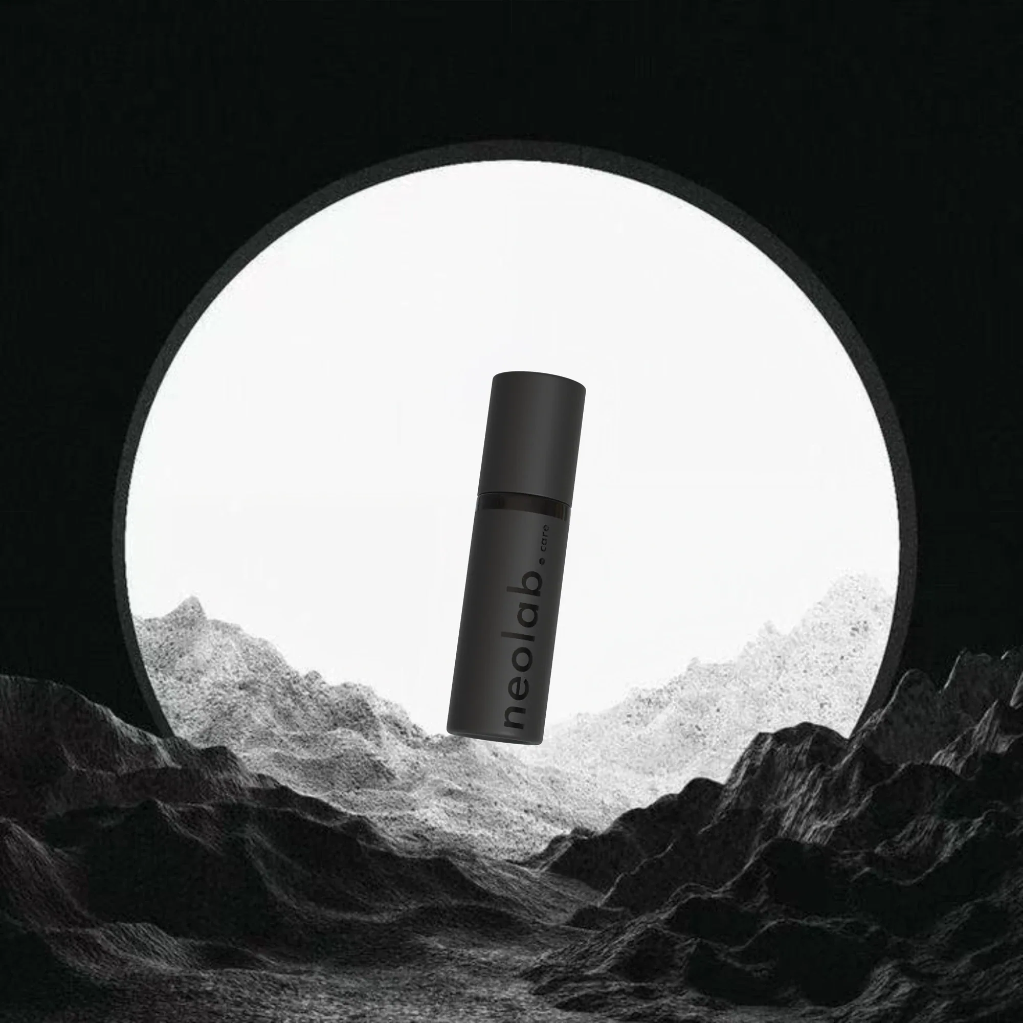
Reduce the visual effort around the product. The object should feel easy to keep close, easy to recognise and visually calm within its surroundings.
Solution
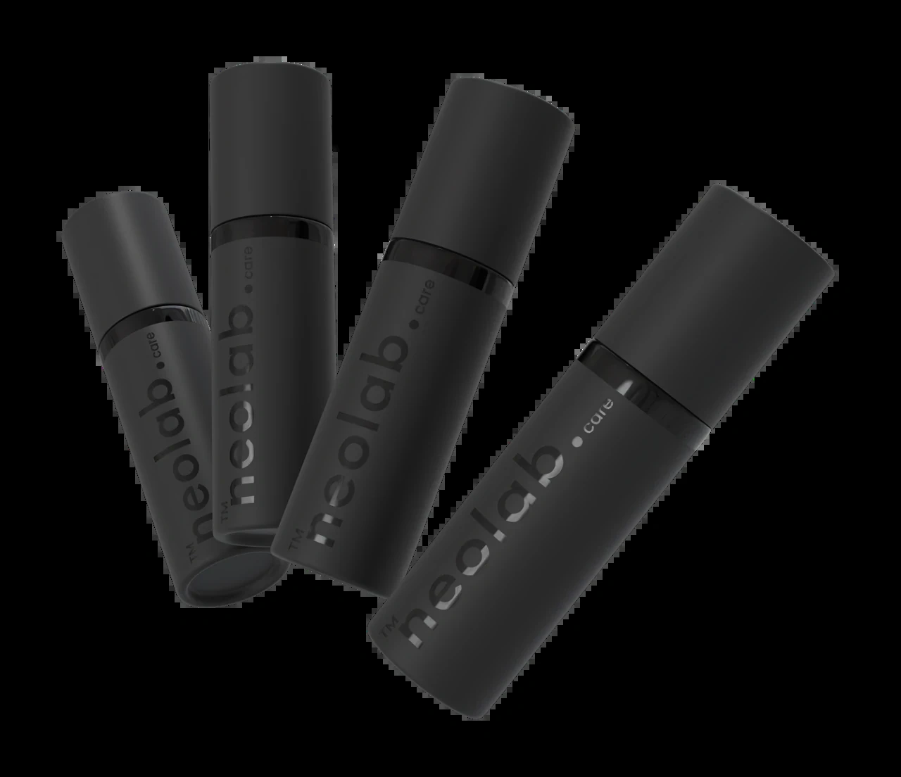
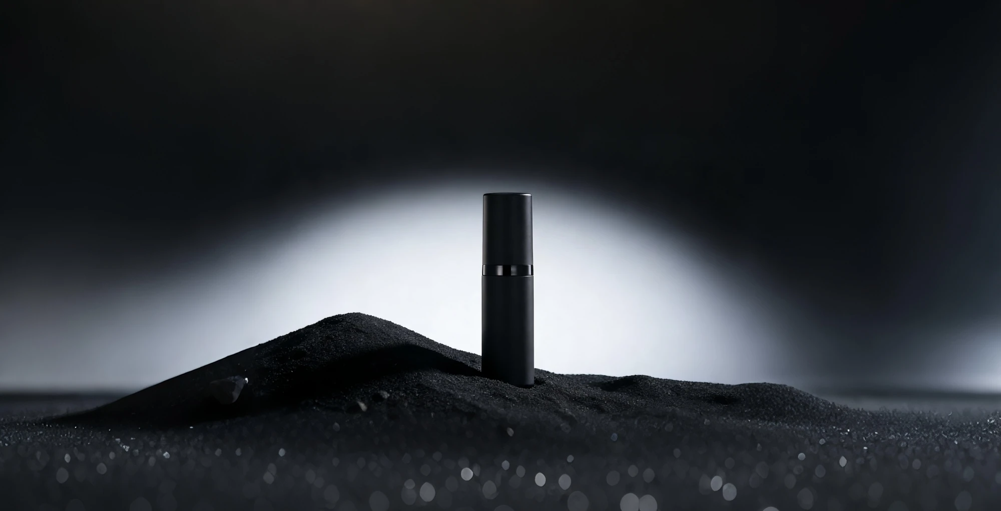
The design response gives a single object a clear presence. A compact bottle, a restrained mark and controlled light make the brand feel considered at every scale.
Original product composition / Multiple views of the same identity.
A coherent product world.Still evolving.
01
Identity and visual directionSource wordmarks, design-board explorations and a defined material palette.
02
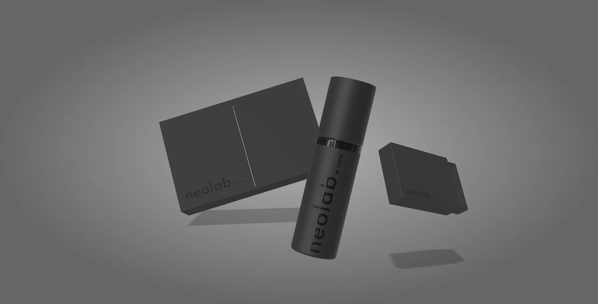
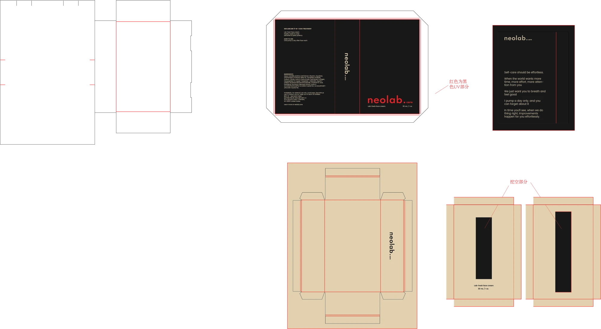
Packaging and product imageryOriginal mockups, high-resolution renders and flat box artwork.
03
Motion and campaign conceptsExisting film material and contextual images.
The work
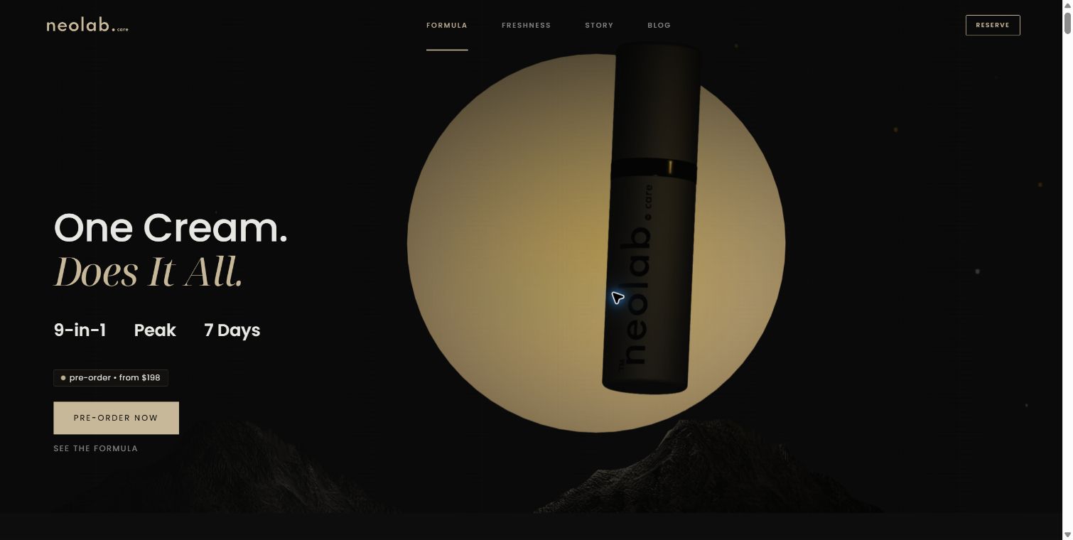
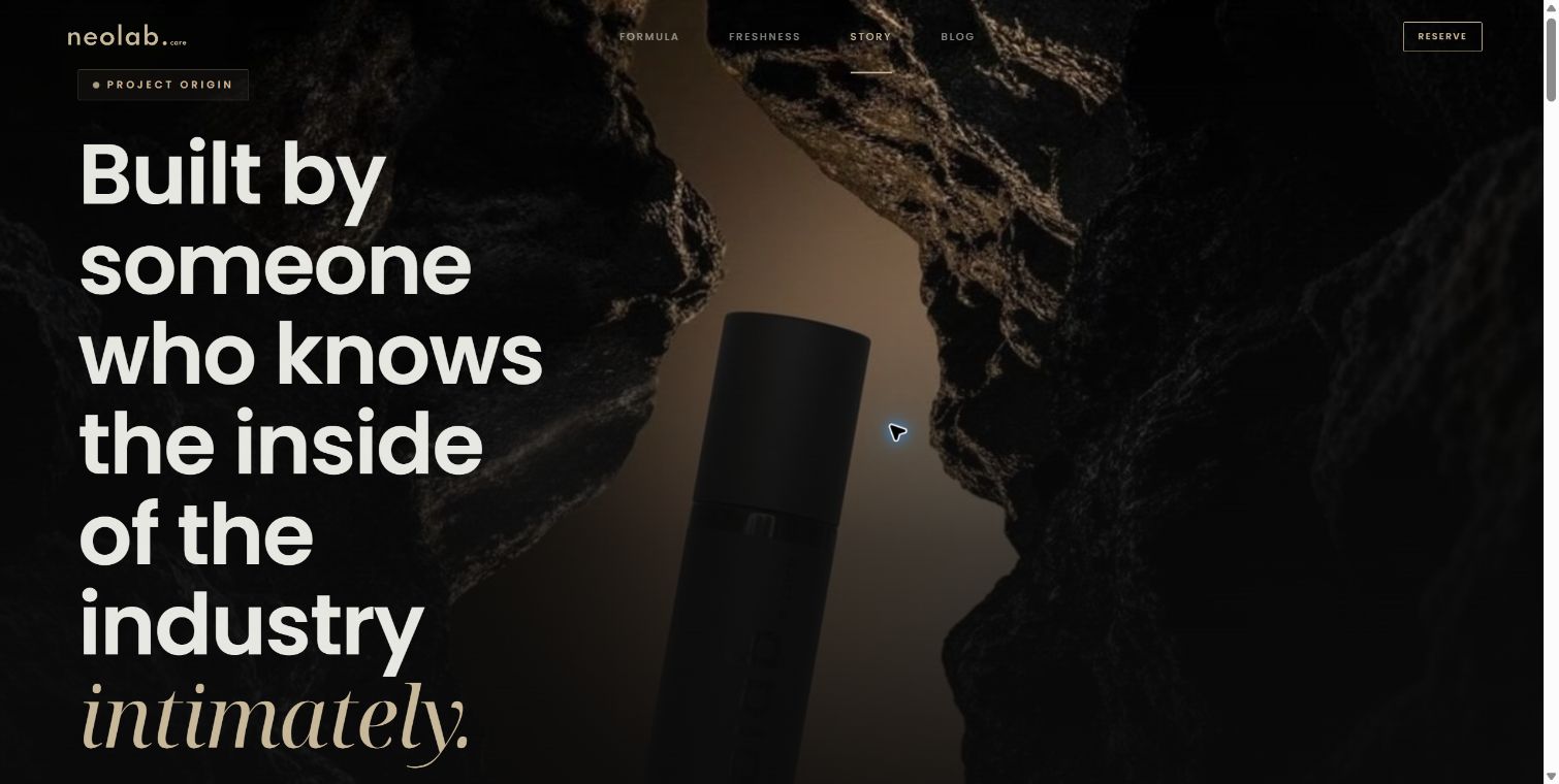
Bottle and gift-packaging mockup / Recovered production artwork.Early design board / Light and texture study.Lifestyle campaign concept. The depicted person is not a customer testimonial.NLC gift-box design / Recovered artwork. Packaging copy and production approval require a separate final check.Homepage / Live website, captured 7 September 2026Story / Live website, captured 7 September 2026
The mark
The identity is more than a black bottle. A custom wordmark, a warm near-black palette, carefully weighted sans-serif type and a contrasting serif form a complete visual language.
Wordmark, sand gold on the near-blackStandalone icon / master asset
The palette
Void Black#0A0A0A · Primary background
Charcoal#1A1A1A · Surface / layer
Sand Gold#C8B89A · Accent / rules / emphasis
Off Black#111111 · Secondary background
Mid#242424 · Mid surface
Gold Light#E0D0B0 · Light accent
Off White#F5F5F0 · Primary text
Colour specimens are reference chips, not suggested page fills. Sand Gold is reserved for accents, rules and typographic emphasis. Crimson #C1121F belongs to physical applications only; it is not a digital accent.
Notes
Pulse Branding project archive. Original supplied brand and concept assets; new editorial case-study treatment. The work is presented as an active brand build: this case does not claim a verified launch, regulatory approval, clinical efficacy or commercial performance.